
Turquoise in the interior is a very attractive solution. Beautiful, refreshing and invigorating, it is able to “enliven” any space, fill it with air, add space and lightness.
Why in practice turquoise in an interior is rather rare? The fact is that this color is quite difficult to apply. It has many shades that do not always go well with each other. It is believed that only an experienced designer can beautifully beat turquoise in the interior.
“Color of happiness.”
What emotions do you feel when you see the turquoise color in the interior? Probably in your imagination associations with the boundless sea, tropical paradise, endless sky are born. Really, the majority of people of different nationalities, sexes and ages positively estimate this colour, calling it joyful, calming and calming.
Turquoise color takes its name from a mineral of turquoise. By the way, this word in translation from Persian means “the stone of happiness”. You should agree that this is a capacious and precise name for the stone, because its hue causes similar associations.
By the way, it wasn’t just the Persians who appreciated turquoise. Both the mineral itself and its hue in Europe in the Middle Ages were considered to bring good luck, filled with divine energy.
Problem of perception
If you decide to use turquoise in your interior, you may face an unexpected problem: all people see this shade differently. Numerous studies have been devoted to this topic, and it has been proven that most women describe turquoise as a variant of green, and men see it as an obvious blue undertone.
Who’s the right person
The use of turquoise and blue in the interior is recommended for people who are experiencing serious psycho-emotional stress. It is proved that the walls painted in the color of the sea wave promote relaxation and relaxation.
Being in an interior with blue color or turquoise, you will notice a tide of forces, you will feel rested and refreshed. Turquoise shades have a positive effect on the nervous and visual systems. Therefore, often turquoise in the interior is used in sanatoriums, medical centers, yoga clubs and other similar places.
Turquoise interior is suitable for those people who are looking for harmony in everyday life. In a city environment, it helps to get visually closer to nature.
Five arguments for turquoise in the interior:
- Shades of turquoise in the interior always look unusual. Such design will not look beaten and template.
- This color is one of the few that do not look vulgar. You can choose bright, contrasting, saturated shades, but the design will still be dignified and elegant.
- The turquoise color in the interior is a compromise: if you can’t agree with other family members on what shades to decorate rooms, the color of the sea wave will surely please everyone.
- This shade helps you to concentrate and concentrate on your work, but it does not excite or stir like red.
- Turquoise or blue in the interior is the perfect solution for those who are tired at work or studying. In such an interior you can relax, rest and get rid of the tension accumulated during the day.
Design advantages of turquoise color
The color of the sea wave has a beneficial effect on a person, but what effect can it have on the design of the room?
If you decide to use turquoise in your interior, you can visually make the space more spacious and free. The secret is that this color has a cold undertone – and cold shades always visually alienate the walls, so the room begins to seem larger than it is. And this applies to all shades of turquoise, with a warm undertone it just does not happen.
This is very convenient – especially if you order finishing materials and decorative items on the Internet. The combination of flowers with a warm and cold undertone looks disharmonious and nalyapisto. In the case of turquoise, this can easily be avoided.
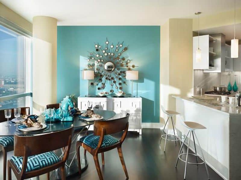
Turquoise color will look good in an interior decorated in any style. In classics, a combination of turquoise, gold and bronze creates a palace style.
What the turquoise color is combined with?
Shades of turquoise are bright and eye-catching, even in split version. They always attract the eye, so the interior design is used not as the main, but as auxiliary, to create accents. So there is a question of what the turquoise color in the interior is combined with. The most successful combinations will be discussed further.
- White
White and turquoise are a win-win combination. It is suitable for interiors decorated in the most different styles – from minimalism to romantic shabby chic. The rooms are light, airy and very spacious. Perhaps this is the most refreshing combination. In this combination you can use several shades of turquoise, as well as add other bright colors – such as black or yellow.
- Gray
This combination of colors in an interior with turquoise also belongs to the classic. Taking as additional shades of white and blue, you can get a light design that visually does not overload the space. To avoid clumsiness, it is necessary to choose shades so that turquoise was the most saturated of them, i.e. grey is best to take in a whitened version.
- Pink
Combination of colours in an interior with turquoise and pink looks very romantic and airy. If the task is to decorate a room in a girlish style, these shades will be the best choice. For the bathroom and kitchen, this design is also a great fit. Interesting effects can be obtained by changing the saturation of these colors.
- Blue, blue, green
These shades are consistent with turquoise in their energy, so they combine and complement each other perfectly. When using their combinations, it is necessary to remember that one of the colors should be the main one, and the second – accent, and the difference between them should be clear and clear. You can achieve this by using different saturation and contrast.
- Yellow
Yellow is a perfect complement to turquoise accent. This combination looks best in a quiet interior – white, grey, cream or ecru.
What kind of decor to use in turquoise interior?
If you have decorated the interior in turquoise color, what decor to choose? We need to find accessories that do not interrupt the bright background shade of the sea wave.
Here are five ideas with successful solutions for decorating the turquoise room:
- Room flowers
Plants have a rich palette of green shades that go well with turquoise. At the same time, they can be not only alive, but also artificial – in the catalog of our online store presents surprisingly realistic compositions.
- Linen textiles
In natural, un-dyed fabrics such as flax is ideal for turquoise color – cold, with a light gray note. From them you can choose pillowcases, dining paths, textile baskets, hanging organizers.
- Ceramic accessories
Flower pots, cachepot, decorative compositions and vases from glazed ceramics will perfectly refresh the turquoise interior.
- Woven decor of vine, rattan, etc.
Turquoise colour in an interior associates with the nature, therefore wicker accessories from natural materials or the tinted wood become fine addition.
- Candles
Large white decorative candles, compositions of candles of different sizes, candles in original candlesticks – all this will perfectly fit into the interior in turquoise style.